Create articles from any YouTube video or use our API to get YouTube transcriptions
Start for freeUnlocking the Power of Color in Graphic Design
Choosing the right colors for your graphic design projects is more than just picking shades that look good. It involves understanding color psychology, how colors affect human emotions, and how they can be strategically used to influence viewer behavior. This guide will walk you through a methodical approach to selecting color schemes that resonate with your audience's emotions and drive engagement.
The Importance of Color Psychology
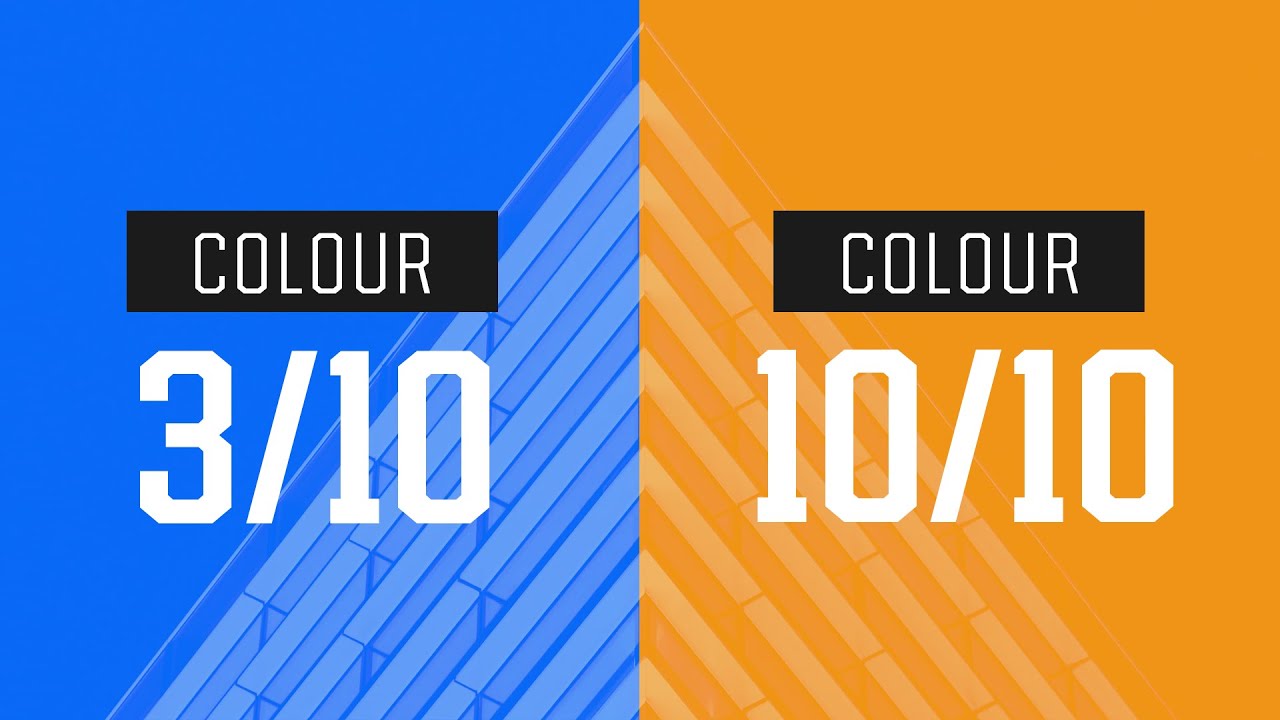
Colors do more than fill space. They communicate feelings and messages. For instance, blue often conveys security and calmness, which is why many financial institutions incorporate it in their branding. On the other hand, orange evokes action and energy, prompting viewers to take specific actions like clicking a button or signing up for a service.
Understanding the emotional impact of colors is crucial because every major brand leverages these insights to connect with their audience. Ignorance of color psychology not only undermines the effectiveness of design but also overlooks a fundamental aspect of human cognitive function.
Step-by-Step Guide to Choosing Colors
1. Define Your Emotional Goals
Start by determining how you want your viewers to feel when they interact with your design. Write down adjectives that describe these emotions, such as 'secure', 'calm', or 'energetic'. These words will guide your color selection process.
2. Analyze Successful Examples
Review successful designs within your target niche. Note how they use color to evoke specific responses from the audience. For example, a landing page designed to reassure visitors might use soft blues, while one intended to energize might opt for vibrant yellows.
3. Consider Your Design’s Personality
Every design has a personality; it could be minimalistic, bold, or playful. Reflect this personality in your choice of colors by considering what each shade communicates psychologically.
4. Utilize Tools and Resources
Use tools like Adobe Color or Sessions College Color Calculator to experiment with different color schemes based on your initial research. These tools help you visualize how various combinations can work together harmoniously.
Implementing Your Color Choices
Once you have selected a few potential color schemes, apply them to your design mock-ups and see which one best conveys the desired emotional responses and fits the overall personality of the design.
Collaborative Tools for Streamlined Workflow
The video also highlights Miller Note as an effective tool for organizing creative projects and collaborating in real-time with colleagues or clients. Its intuitive interface mimics working on a physical wall in a creative studio setting, making it an excellent resource for designers looking to streamline their workflow.
The integration of thoughtful color selection with efficient project management tools like Miller Note can significantly enhance both the creative process and final outcomes in graphic design projects.
The journey through mastering color psychology in graphic design is not just about aesthetics but understanding human behavior and using this knowledge to create compelling designs that perform well both visually and functionally.
Article created from: https://www.youtube.com/watch?v=GrV3qVjd5Ek&pp=ygUiYmVzdCBjb2xvciBzY2hlbWUgc2VsZWN0aW9uIHNhdG9yaQ%3D%3D