Create articles from any YouTube video or use our API to get YouTube transcriptions
Start for freeUnderstanding the Color Wheel and Its Importance in Design
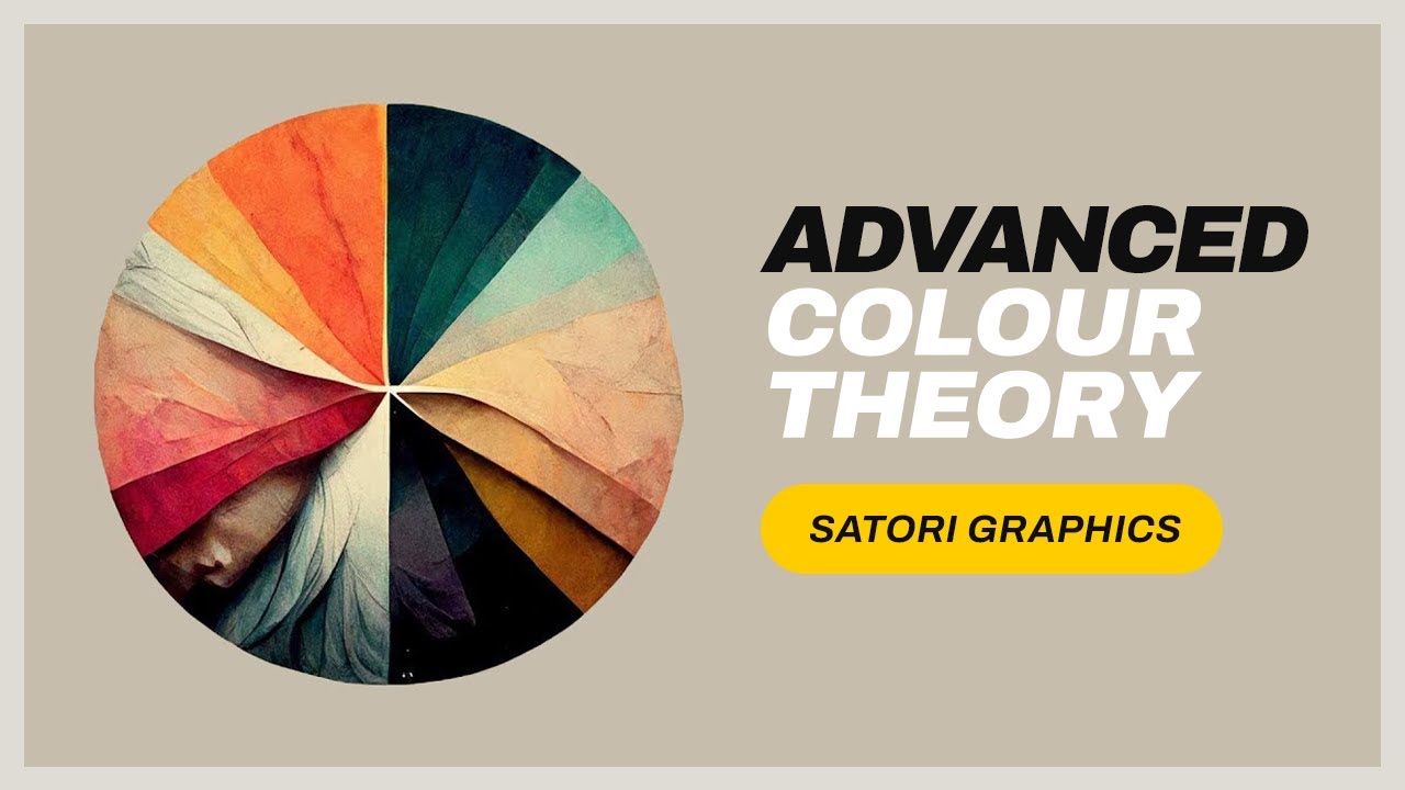
The color wheel is a fundamental tool for any graphic designer. It not only helps in creating aesthetically pleasing designs but also in conveying the right message. The wheel is divided primarily by hues, tints, tones, and shades. Hues represent the pure colors found on the outer edge of the wheel. Tints are created by adding white to a hue, tones by adding both white and black, and shades by adding black.
Utilizing Monochrome Color Schemes
Monochrome schemes involve selecting a single hue and modifying it with black or white to produce tints, tones, or shades. This creates a smooth visual flow with minimal contrast, making it ideal for designs that require a subtle and soothing visual effect. However, due to their lack of contrast, monochrome designs are not suited for projects that need to capture immediate attention.
The Impact of Complementary Colors
Complementary colors sit directly opposite each other on the color wheel. This scheme is highly effective in attracting viewer attention due to its strong contrast. For instance, both the Firefox logo and Fanta’s branding utilize complementary colors to stand out. To soften the visual impact while maintaining depth, designers can use variations like a hue with its tint and then pair these with their complementary counterparts.
Explorations with Analogous Color Schemes
Analogous color schemes are slightly more complex than monochrome but less so than complementary schemes. They involve selecting three colors that lie next to each other on the wheel. These schemes offer more harmony than contrast, making them suitable for projects that require a gentle yet visually cohesive appearance.
Triadic Colors for Bold Statements
Triadic color schemes are vibrant and dynamic. By selecting three colors that are evenly spaced around the color wheel, this scheme is perfect for designs that need to be eye-catching yet balanced. It’s particularly useful in infographics where distinctiveness is crucial without overwhelming the content. A notable example of triadic use is Burger King’s logo which uses this scheme to create an impactful brand identity.
Navigating Split Complementary Colors
Split complementary schemes provide an interesting challenge in balance. By choosing one base color and taking two adjacent tertiary colors opposite it on the wheel, this scheme offers more nuance than a standard complementary scheme without sacrificing vibrancy. It requires careful adjustment of tints and shades but can produce striking results when executed well.
Practical Tips for Applying Color Theory:
- Experiment: Always try different combinations within these schemes before finalizing your design.
- Balance: Ensure there's a good balance between attention-grabbing elements and those that blend more subtly.
- Context Matters: Consider what emotion or message you want your design to convey when choosing your colors.
- Keep Learning: Stay updated with new trends in color theory as they can introduce you to new ideas for your projects.
- Subscribe for More Insights: For those keen on enhancing their graphic design skills further regarding color usage, following dedicated graphic design channels like Satori Graphics can be immensely beneficial.
Article created from: https://www.youtube.com/watch?v=r7CFyVtme9o&pp=ygUkTWFzdGVyIENPTE9VUiBHUk9VUFMgX0NvbG91ciBUaGVvcnlf

