Create articles from any YouTube video or use our API to get YouTube transcriptions
Start for freeUnderstanding the Impact of Color in Graphic Design
Color is not just a visual element in graphic design; it's a critical tool that communicates mood, sets tone, and influences decisions. When used effectively, color can transform a simple design to something memorable and impactful. This guide will delve further on how to harness the power of color in your designs.
The Role of Color Psychology
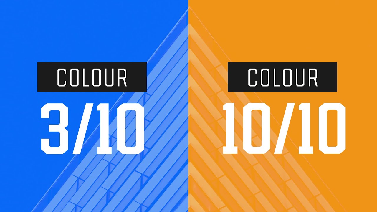
Color psychology plays a pivotal role in graphic design. It helps designers understand how different hues can evoke specific emotions. For instance, consider a gym or exercise poster initially designed in grayscale. Introducing vibrant colors like orange can inject energy and enthusiasm, reflecting the dynamic nature of exercise. Orange is often associated with vitality and excitement—qualities that are perfect for motivating someone to start their fitness journey.
Key Emotional Associations with Colors:
- Orange: Energy, excitement, change
- Red: Danger, passion, warning
- Green: Nature, tranquility, health
By understanding these associations, designers can choose colors that align with the message they want to convey.
Selecting Colors for Different Purposes
When designing for specific products or services like skincare or beauty products aimed at women, color selection becomes even more crucial. Soft pastel tones such as pinks and light browns are often used because they evoke openness and relaxation—feelings that are desirable when promoting beauty products. These colors not only resonate well with the target audience but also enhance the overall aesthetic appeal of the product.
Why Pastel Colors Work Well for Beauty Products:
- They represent softness and purity.
- They help create a calming and inviting visual experience.
- They are traditionally associated with femininity.
Implementing Color Through Design Principles
Beyond emotional impact, certain graphic design principles regarding color usage can greatly enhance a project's effectiveness. One such principle is using complementary colors—hues that are opposite each other on the color wheel. This technique creates high contrast and visual interest making the design stand out while remaining aesthetically pleasing.
For example, if you're designing a landing page where you want certain elements like call-to-action buttons to pop out more prominently against a subdued background, using complementary colors could be an effective strategy.
Benefits of Using Complementary Colors:
- Creates strong visual contrasts.
- Enhances readability and focal points in designs.
- Makes designs visually appealing and memorable.
Practical Tips for Applying Color in Designs
The application of color must be thoughtful and strategic to ensure it aligns with both the brand’s message and user expectations:
- Understand the brand identity: Colors should reflect the brand’s personality whether it’s energetic, professional or playful.
- Consider cultural connotations: Different cultures perceive colors differently; what works in one region may not work in another.
- Test different palettes: Experimentation helps find what best suits your specific project needs while still appealing to users’ emotions through color psychology.
- Use tools for precision: Utilize digital tools to get exact hues right which ensures consistency across all designs related to one brand or campaign.
- Keep accessibility in mind: Ensure there’s enough contrast between text and background colors so everyone including people with visual impairments can easily read your content.
Article created from: https://www.youtube.com/watch?v=XkBNUJcrjlw&pp=ygUvaG93IGFtYXRldXIgZGVzaWduZXJzIGdldCBjb2xvciBzbyB3b3JuZyBzYXRvcmk%3D


