Create articles from any YouTube video or use our API to get YouTube transcriptions
Start for freeIntroduction
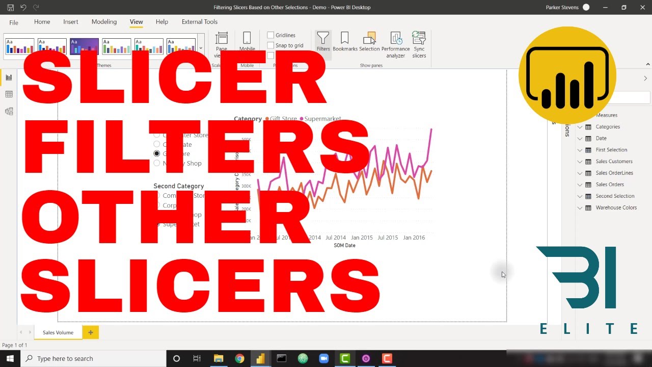
Power BI is a powerful tool for data visualization and analysis, offering a wide range of features to help users create insightful reports. One of the most useful techniques in Power BI is the ability to compare categories dynamically. This article will guide you through the process of creating dynamic category comparison slicers in Power BI, allowing users to select and compare two categories without overlap.
Understanding the Problem
When working with categorical data in Power BI, it's often necessary to compare two categories side by side. However, the default slicer functionality doesn't allow for easy exclusion of a selected category from the other slicer. This can lead to confusion and potential errors in analysis.
The Solution: Dynamic Category Comparison Slicers
To solve this problem, we'll create two separate slicers that dynamically filter each other, ensuring that the selected category in one slicer is automatically excluded from the other. This technique involves several key steps:
- Creating disconnected tables
- Setting up the slicers
- Implementing a DAX measure for filtering
- Applying the filter to the slicers
- Creating a measure for visual comparison
Let's dive into each of these steps in detail.
Step 1: Creating Disconnected Tables
The first step in our process is to create two disconnected tables. These tables will serve as the data sources for our slicers, allowing us to manipulate them independently of the main data model.
Creating the First Selection Table
- Go to the Modeling tab in Power BI Desktop.
- Click on "New Table".
- Name the table "First Selection".
- Use the following DAX expression:
This expression will create a table with all distinct category names from your main Categories table.First Selection = VALUES(Categories[Category Name])
Creating the Second Selection Table
- Repeat the process for the second table.
- Name it "Second Selection".
- Use the same DAX expression or reference the First Selection table:
Second Selection = 'First Selection'
After creating these tables, verify in the modeling view that they are not connected to any other tables in your data model. This disconnection is crucial for the dynamic filtering to work correctly.
Step 2: Setting Up the Slicers
Now that we have our disconnected tables, we can set up the slicers that will allow users to select categories for comparison.
- Create a new slicer visualization.
- For the first slicer, use the "Category Name" field from the "First Selection" table.
- Set the slicer to "Single select" mode in the formatting options.
- Create a second slicer and use the "Category Name" field from the "Second Selection" table.
- Again, set this slicer to "Single select" mode.
At this point, your slicers will be functional but won't interact with each other or filter your main visuals. We'll address this in the next steps.
Step 3: Implementing a DAX Measure for Filtering
To make our slicers filter each other dynamically, we need to create a DAX measure. This measure will determine whether a category should be displayed in a slicer based on the selection in the other slicer.
- Create a new measure.
- Name it "Category Selection Filter".
- Use the following DAX expression:
Category Selection Filter =
IF(
    SELECTEDVALUE('First Selection'[Category Name]) =
    SELECTEDVALUE('Second Selection'[Category Name]),
    0,
    1
)
This measure returns 0 if the selected values in both slicers are the same, and 1 if they're different. We'll use this to filter out the selected category from the opposite slicer.
Step 4: Applying the Filter to the Slicers
Now that we have our filter measure, we need to apply it to both slicers:
- Select the first slicer.
- In the Filters pane, add the "Category Selection Filter" measure.
- Set the filter to show items when the value is 1.
- Repeat this process for the second slicer.
With these filters in place, selecting a category in one slicer will automatically remove it from the other slicer, preventing overlap in selections.
Step 5: Creating a Measure for Visual Comparison
The final step is to create a measure that will allow us to visualize the comparison between the selected categories.
- Create a new measure.
- Name it "Sales Category Comparison".
- Use the following DAX expression:
Sales Category Comparison =
CALCULATE(
    [Total Sales],
    FILTER(
        Categories,
        Categories[Category Name] IN {
            SELECTEDVALUE('First Selection'[Category Name]),
            SELECTEDVALUE('Second Selection'[Category Name])
        }
    )
)
This measure calculates the total sales for the categories selected in both slicers. You can now use this measure in your visuals to display the comparison.
Implementing the Solution in Your Report
Now that we have all the components in place, let's walk through how to implement this solution in your Power BI report:
- Replace your existing category slicer with the two new slicers we created.
- In your main visual (e.g., a line chart or bar chart), replace the existing sales measure with the new "Sales Category Comparison" measure.
- Test the functionality by selecting different categories in each slicer and observing how the visual updates.
Advanced Techniques and Considerations
While the basic implementation provides a powerful way to compare categories, there are several advanced techniques and considerations to keep in mind:
Multi-Select Options
The current implementation uses single-select slicers. If you want to allow users to select multiple categories in each slicer, you'll need to modify the DAX measures accordingly. This could involve using the SELECTEDVALUES() function instead of SELECTEDVALUE() and adjusting the filtering logic.
Performance Optimization
For large datasets, you may need to optimize the performance of your dynamic slicers. Consider using techniques such as:
- Pre-aggregating data where possible
- Using calculated tables instead of calculated columns
- Implementing query folding for data sources that support it
Visual Enhancements
To improve the user experience, consider adding visual cues to indicate which categories are selected and which are filtered out. This could include:
- Custom formatting for selected items in the slicers
- Tooltips that explain the filtering behavior
- A reset button to clear all selections
Error Handling
Implement error handling in your measures to account for scenarios where no categories are selected. This will prevent blank or error states in your visuals.
Cross-Filtering
If you have other visuals in your report, you may want to implement cross-filtering between the category comparison and other elements. This can be achieved by using the CROSSFILTER() function in your DAX measures.
Best Practices for Dynamic Category Comparison
To ensure the best possible implementation of dynamic category comparison in your Power BI reports, follow these best practices:
-
Document your measures: Clearly comment your DAX code to explain the logic behind each measure. This will make it easier for you and others to maintain the report in the future.
-
Use meaningful names: Choose descriptive names for your tables, measures, and columns. This improves readability and makes it easier to understand the purpose of each element.
-
Test thoroughly: Before publishing your report, test it with various data scenarios to ensure that the dynamic filtering works correctly in all cases.
-
Provide user guidance: Include instructions or tooltips in your report to explain how the dynamic category comparison works. This will help users understand and effectively use the feature.
-
Monitor performance: Keep an eye on the performance of your report, especially if you're working with large datasets. Use Power BI's performance analyzer to identify and address any bottlenecks.
-
Stay updated: Power BI is constantly evolving. Stay informed about new features and best practices that could improve your dynamic category comparison implementation.
Troubleshooting Common Issues
Even with careful implementation, you may encounter some issues when working with dynamic category comparison in Power BI. Here are some common problems and their solutions:
Slicers Not Filtering Each Other
If your slicers aren't filtering each other as expected:
- Double-check that the "Category Selection Filter" measure is correctly applied to both slicers.
- Verify that the disconnected tables are truly disconnected in the data model.
- Ensure that the DAX expressions in your measures are referencing the correct table and column names.
Visuals Not Updating
If your visuals aren't updating based on slicer selections:
- Check that the "Sales Category Comparison" measure is correctly implemented in your visuals.
- Verify that the measure is referencing the correct base sales measure (e.g., [Total Sales]).
- Ensure that there are no conflicting filters applied to your visuals.
Performance Issues
If you're experiencing slow performance:
- Review your data model for unnecessary relationships or calculated columns.
- Consider using DAX Studio to analyze and optimize your measures.
- Look for opportunities to pre-aggregate data or use query folding.
Expanding the Concept: Beyond Two Categories
While our implementation focuses on comparing two categories, the concept can be expanded to handle more complex scenarios:
Multiple Category Levels
You can adapt the technique to work with hierarchical category structures. For example, you could create slicers for main categories and subcategories, with dynamic filtering between levels.
Time-based Comparisons
Combine the category comparison with time intelligence functions to allow users to compare categories across different time periods.
Dynamic Measure Selection
Extend the concept to allow users to select not just categories, but also the measures they want to compare (e.g., sales vs. profit vs. units sold).
Conclusion
Dynamic category comparison in Power BI is a powerful technique that can significantly enhance the analytical capabilities of your reports. By following the steps outlined in this guide, you can create interactive and user-friendly reports that allow for seamless comparison between categories.
Remember that the key to successful implementation lies in understanding the underlying concepts of disconnected tables, DAX measures, and slicer interactions. With practice and experimentation, you can adapt these techniques to suit a wide range of analytical needs.
As you continue to develop your Power BI skills, keep exploring new ways to leverage these dynamic comparison techniques. The flexibility of Power BI allows for endless possibilities in data visualization and analysis, and mastering dynamic category comparison is a significant step towards creating truly insightful and interactive reports.
By implementing these advanced techniques, you'll be able to provide your users with powerful tools for data exploration and decision-making, ultimately driving better business outcomes through informed analysis.
Article created from: https://www.youtube.com/watch?v=O0VsTLDTjss